A bar graph, also called a bar chart, represents data graphically in the form of bars. The height of the bars corresponds to the data they represent. Like all graphs, bar graphs are also presented on a coordinate plane having an x-axis and a y-axis.
Parts
The different parts of a bar graph are:
Title
Bars
Categories
x-axis
x-axis label
y-axis
y-axis label
Scale
How to Draw a Bar Graph
Let us consider an example. Sam went to the vegetable market and bought some vegetables. He bought 6 kg of potatoes, 8 kg of onions, 5 kg of tomatoes, and 3 kg of capsicum. He now wants to display the data as a bar graph.
To create the bar graph in an Excel sheet, he needs to follow the following steps:
Giving a title to the graph, for example, ‘Vegetables Bought.’
Drawing a horizontal x-axis and a vertical y-axis
Labeling the axes: The x-axis is ‘Types of Vegetables’, which is an independent variable, and the y-axis is ‘Weights of Vegetables’, which is a dependent variable
Naming the vegetables: Potatoes, onions, tomatoes, and capsicum, and giving an equal gap between each bar on the horizontal axis.
Scaling the graph. For example, it is written as 1 unit = 1 kg
Drawing the bars corresponding to the available data.
Following the steps, if we plot the above data, the bar graph will look as shown.
Parts Bar Graph
Properties
The key properties of a bar graph are:
It represents numerical data by rectangles of equal width but varying height
The height of the bars depends on the value it represents
The gap between the bars is uniform
It can be vertical or horizontal
Types
Bar graphs are used to represent the frequencies of categorical variables. They are mainly of two types: vertical and horizontal.
Vertical Bar Graphs
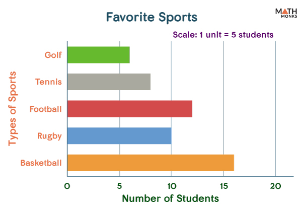
Let us assume that Rob has taken a survey of his classmates to find which kind of sports they prefer and noted the result in the form of a table.
Types of Sports
Golf
Tennis
Football
Rugby
Basketball
Number of Students
6
8
12
10
16
When we represent the above data in the form of a vertical bar graph, it shapes up like this:
Bar Graph Chart
This form of representation is most commonly used in statistics.
Horizontal Bar Graphs
However, bar graphs can also be presented horizontally. If we represent the above data horizontally, it looks like as shown below:
Bar Graph 2
Sometimes we need to present data representing a group. Such data are presented as either vertical or stacked bar graphs.
Other Types
Grouped Bar Graphs
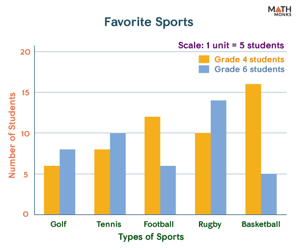
Also known as the clustered bar graph, it plots numeric values for levels of 2 or more categorical variables instead of one side-by-side. Here, the rectangular bars are grouped by position for levels of one categorical variable, with the same colors indicating the secondary category level within each group.
A grouped bar graph showing 2 sets of data is called a double bar graph. It can be both vertical and horizontal.
Let us represent the given data using a vertical double-bar graph.
Number of Students Playing Sports
Golf
Tennis
Football
Rugby
Basketball
Grade 4
6
8
12
10
16
Grade 6
8
10
6
14
5
Scaled Bar Graph
This is an example of a double bar graph from which we can quickly identify the sport that is most popular of all and the least popular one. It also shows the relative sizes of the things under study.
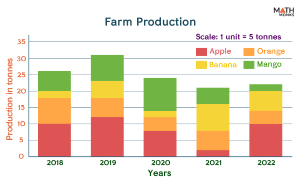
Stacked Bar Graphs
Also known as the segmented or composite bar graph, it divides the whole graph into different parts. Each part of the bar represents a particular category with a different color. Thus, a bar represents the whole, and each segment is a part of the whole.
A stacked bar graph can be both vertical and horizontal.
Let us represent the data of a farm producing apples, oranges, bananas, and mangoes for the years 2018, 2019, 2020, 2021, and 2022 in the form of a stacked bar graph.
Production in tonnes
2018
2019
2020
2021
2022
Apple
10
12
8
2
10
Orange
8
6
4
6
4
Banana
2
5
2
8
6
Mango
6
8
10
5
2
Bar Graph 3
What is a Bar Graph Used For
Students widely use bar graphs to represent numeric data in mathematics and statistics. However, it is also used in various industries for business and finance. Some of its uses are:
Comparison between 2 or more variables is easy
It is prepared without much effort
It helps to determine a pattern in data collected over a long period
Represents data that are grouped into categories. For example, it is used to show the difference in the votes obtained by the winning candidate compared to the rest.
It also estimates the percentage of some quantity compared to the rest.
Bar Graph vs. Histogram
The main difference is that a bar graph represents ungrouped data. In contrast, a histogram is used to represent grouped data. Again, the bars are not adjacent in a bar graph, whereas in a histogram, the bars are adjacent.
Solved Examples
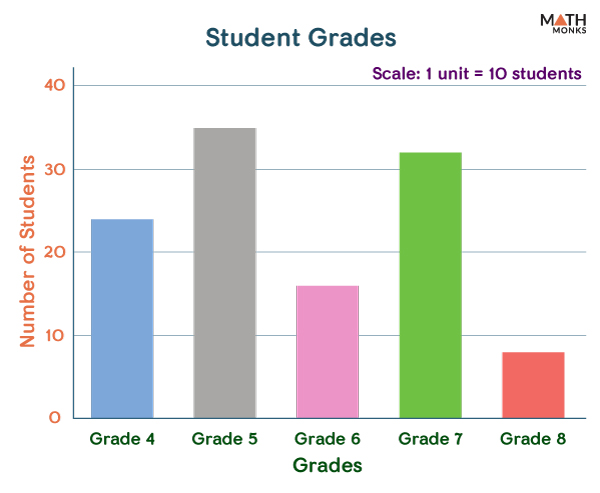
E.g.1. Draw a bar graph of the number of students newly admitted to a school in different grades.
Grades
4
5
6
7
8
Number of Students
24
35
16
32
8
Answer:
Bar Graph Example 1
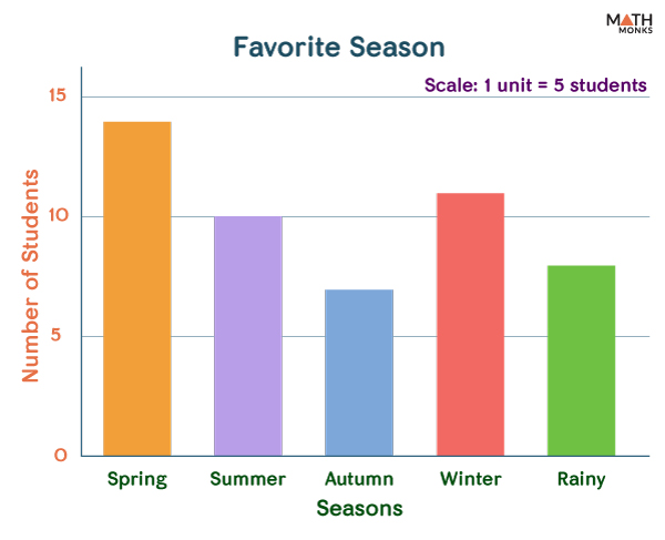
E.g.2. A survey of 50 students about their favorite season of the year is listed. Prepare a bar graph to show which season is most popular among them.
Seasons
Spring
Summer
Autumn
Winter
Rainy
Number of Students
14
10
7
11
8
Answer:
Bar Graph Example 2
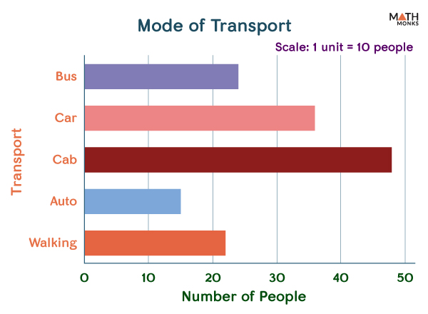
E.g.3. Draw the horizontal bar graph for the given data set between the number of people and their preferred mode of transport.
Mode of Transport
Bus
Car
Cab
Auto
Walking
Number of People
24
36
48
15
22
Answer:
Bar Graph Example 3
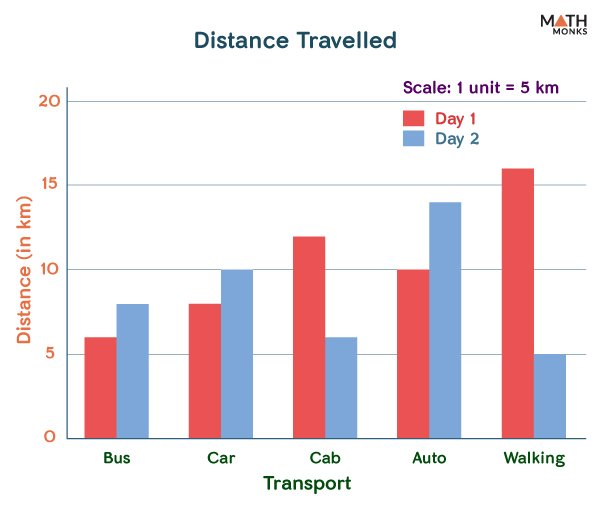
E.g. 4. Represent the given data in a double-bar graph.
Distance travelled (in km)
Bus
Car
Cab
Auto
Walking
Day 1
6
8
12
10
16
Day
8
10
6
14
5
Answer:
Bar Graph Example 4
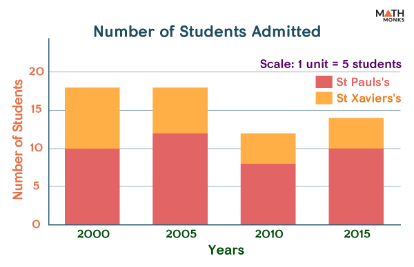
E.g.5. The table shows the number of students newly admitted to St Paul’s and St Xavier’s schools in the following years. Represent your data in the form of a horizontal segmented bar graph.