A bar graph and a line graph are two different ways of representing categorical data in statistics.
When to Use Bar Graph and Line Graph
Bar Graph
A bar graph uses rectangular blocks of different heights, where the height represents the value of the quantity. The quantity can be anything from frequencies, percentages, or values in any unit of measurement.
However, they are mainly used to represent data divided into categories. It is a good choice for comparing data between classes when the values differ significantly. An insignificant or slight difference in values will not be evident.
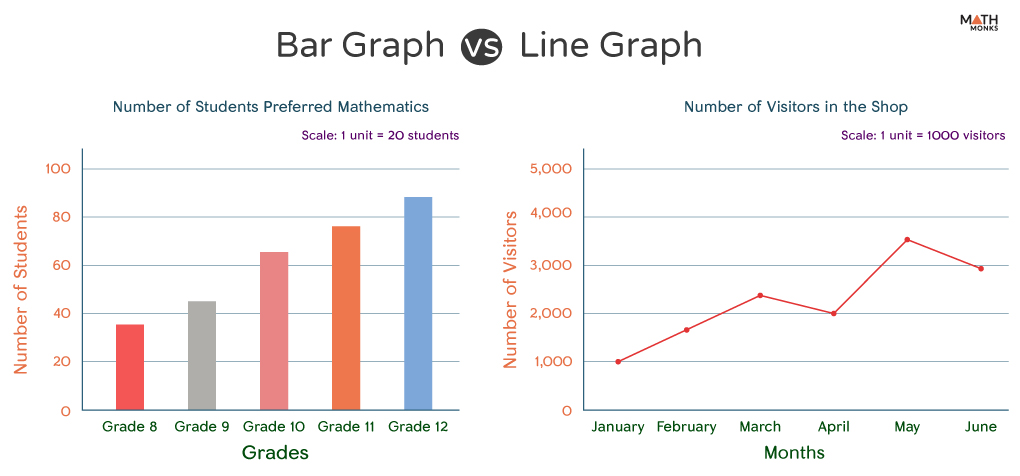
For example, if we represent the data on the number of students that preferred mathematics as their most liked subject from grade 8 to grade 12 in the table below, we will obtain the following bar graph.
Grades
Number of Students
Grade 1
34
Grade 2
43
Grade 3
67
Grade 4
78
Grade 5
89
Line Graph
In contrast, a line graph represents data that changes over time. It is a continuous line that connects individual data points in a curve. Compared to the bar graph, a line graph is a better choice to visualize the relationship between two variables over time or space. They can also track changes over the same period for multiple groups.
For example, if we want to monitor the number of visitors in a shop each month for 6 months, we can get an idea about it if we plot a line graph with the given data.
Months
Number of Visitors
January
1024
February
1678
March
2389
April
1986
May
3560
June
2923
Bar Graph vs. Line Graph
Differences
Thus, the main differences between a bar and a line graph are:
Basis
Bar Graph
Line Graph
1. Type of Data
They are used to compare categorical or nominal data where the categories are distinct and do not overlap.
They are used to represent continuous data when it is important to represent the changes in the data over time.
2. Presentation of Data
Represented by rectangular bars where the length of the bar is proportional to the quantity of the data.Each bar represents a different category of data.
Data points are plotted and then connected by a line to show change over time.A single line represents the same category of data.
3. Comparison
Here, it is easy to compare between different groups.
Here, it is easy to understand the trends and patterns in data over time.
4. Axes
The x-axis represents different categories of dataThe y-axis represents the quantity or frequency of those categories.
The x-axis often represents the timeThe y-axis represents the quantity being measured over time.