A double bar graph, or a side-by-side bar graph, is a visual representation showing two sets of interrelated data using bars of different colors or shades. Most often, the x-axis shows the categories being compared for the two groups, while the y-axis shows the scales used for comparing the values.
A double bar graph is made in the same way as a single bar graph. It can be vertical or horizontal. Also, there is a key that gives the color of the bar that represents each group.
How to Make a Double Bar Graph
While making a double bar graph, we should follow the following steps:
Determine the number of categories and groups
Determine which category has the highest and the lowest value
Determine other categories like half and equal values
Plotting the graph in Excel or any other plotter
Example
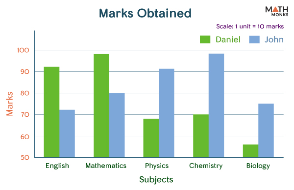
A survey was conducted on the marks obtained by Daniel and John in the 5 subjects studied at St. Johns High School. The result is given in the table below.
Let us represent the following data using the double bar graph.
Marks Obtained
Subjects
Daniel
John
English
92
72
Mathematics
98
80
Physics
68
91
Chemistry
70
98
Biology
56
75
It is a comparative data, best represented using a vertical double-bar graph.
Double Bar Graph
If we analyze and interpret the graph, we can answer questions related to it.
Questions
Let us suppose your teacher asked you the following question:
a) Find the highest mark obtained by Daniel in a subject.
b) Find the lowest mark obtained by John in a subject.
c) Name the subject in which there is a maximum difference in the marks obtained by them and by how much.
d) Name the subject with the least difference in the marks obtained by Daniel and John.
Answers
a) To answer the question (a), we will see the longest bar in pink.
Here, we see that the pink bar in Mathematics is the highest. Thus, it is the highest mark obtained by Daniel in a subject. The marks (in the y-axis) corresponding to the bar are found to be 98.
b) To answer question (b), we will see the shortest bar in red.
Here, we see that the red bar in English is the shortest. Thus, it is the lowest mark obtained by John in a subject. The marks (in the y-axis) corresponding to the bar are 72.
c) To answer the question (c), we will see the maximum difference between a pair of pink and red bars.
Here, we see that the difference is highest in biology.
To find the difference, we will record the marks obtained by Daniel and John in biology and then find the difference between them.
Here,
Marks obtained by Daniel in Biology = 98
Marks obtained by John in Biology = 75
The difference is:
=> 75 – 56 = 19
d) To answer the question (c), we will see the least difference between pink and red bars.
Here, we see that the difference is the least in Mathematics.
To find the difference, we will record the marks obtained by Daniel and John in Mathematics and then find the difference between them.
Here,
Marks obtained by Daniel in Mathematics = 56
Marks obtained by John in Mathematics = 80
The difference is:
=> 98 – 80 = 18
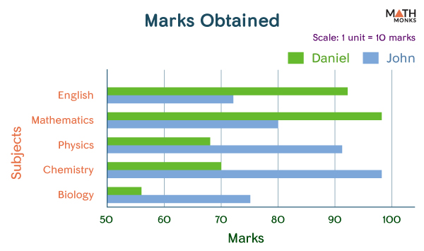
The same graph can also be represented in the horizontal form.
Double Bar Graph Horizontal
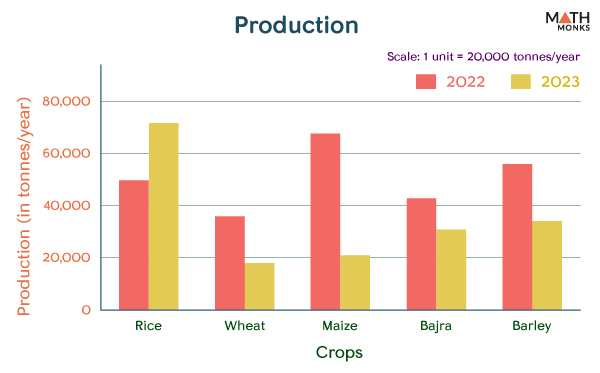
E.g.1. Plot the given data showing the production of some cash crops in the years 2022 and 2023 in California using the double bar graph.
Production (in tonnes) in California
Cash Crops
Daniel
John
Rice
50000
72000
Wheat
36000
18000
Maize
68000
21000
Bajra
43000
31000
Barley
56000
34000
By plotting the above data in the form of a double bar graph, we get the following: