A horizontal bar graph, also known as a horizontal bar chart, is similar to a regular bar graph with the difference that the data are represented horizontally. Mathematically, the x and the y-axis of a horizontal bar graph are switched compared to the vertical bar graph.
Similar to conventional bar graphs, here, the length or height of each bar is proportional to the values they represent. The x-axis represents the values corresponding to each data category, while the y-axis shows the different categories of data.
Scale
The scale of a bar shows the relation between the unit lengths of the bar and the data provided in the graph. It refers to numbers that indicate certain intervals on a graph.
For example, a graph where 1 unit = 10 students, 2 units = 20 students, and so on.
Steps
Drawing the vertical x-axis and the horizontal y-axis
The category for comparison is placed on the y-axis, and the measure of the subject is on the x-axis
Plotting the vertical X-axis and then the horizontal Y-axis up to the length that is proportional to the value
Selecting different colors for each category
Adding the labels and title of the graph
Solved Example
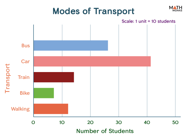
Here is a horizontal bar graph showing the survey result representing the mode of transport availed by 100 students in a class.
Modes of Transport
Number of Students
Bus
26
Car
41
Train
14
Bike
7
Walking
12
Horizontal Bar Graph
Types
Horizontal bar graphs can be of 3 types:
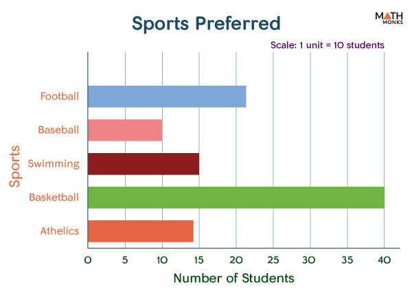
Simple Horizontal Bar Graphs
Here, the categories are compared based on a single parameter. The graph plotted above is an example of a simple horizontal bar graph. Let us plot a simple horizontal bar graph with the data collected from 100 students in a class:
Sports Preferred
Number of Students
Football
26
Baseball
41
Swimming
14
Basketball
7
Athletics
12
Horizontal Bar Graph Example
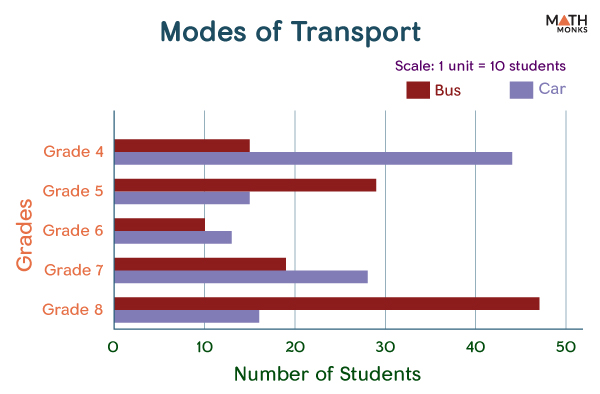
Double Horizontal Bar Graphs
In this type of graph, we can compare different categories based on two parameters. For example, it can compare the modes of transport preferred by 100 students of grade 4 to grade 8.
Number of Students
Modes of Transport
Grade 4
Grade 5
Grade 6
Grade 7
Grade 8
Bus
15
29
10
19
47
Car
44
15
13
28
16
Horizontal Bar Chart
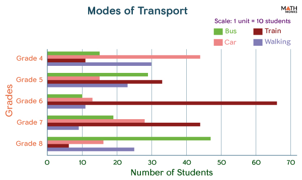
Multiple Horizontal Bar Graphs
As the name suggests, here we can compare categories based on more than 2 parameters. For example, it can compare the modes of transport preferred by 100 students of grade 4 to grade 8.