A stacked bar chart, also known as a stacked bar graph or segmented bar graph, uses segmented vertical or horizontal bars to represent categorical data. The segments can be of different colors or shades to make the data easier to understand. Each bar shows the proportional contribution of individual data compared to the total. Here, the individual contributions will always add up to 100%.
They also compare data between groups or as a relative frequency table. Segmented bar charts are one of the most popular graphs in Statistics.
How to Make a Segmented Bar Chart with Example
Let us learn how to create a simple stacked bar graph with steps.
Step 1: Collection of Samples
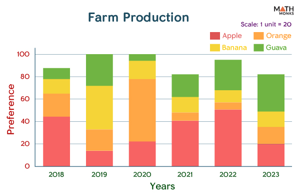
For sample collection, we surveyed 100 farmers about their preferences for fruit cultivation in the last five years. The table below shows the results of the survey.
2018
2019
2020
2021
2022
2023
Apple
44
18
22
41
51
20
Orange
21
15
56
7
6
15
Banana
13
39
16
14
11
14
Guava
10
28
6
20
27
33
Step 2: Plotting the Graph
On representing the above data in the form of a segmented bar chart, we get:
Vertical Stacked Segmented Bar Chart Graph
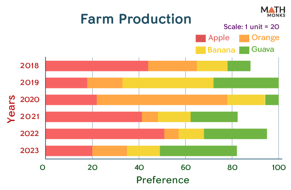
The same data can also be plotted in the form of stacked horizontal bars:
Horizontal Stacked Segmented Bar Chart Graph
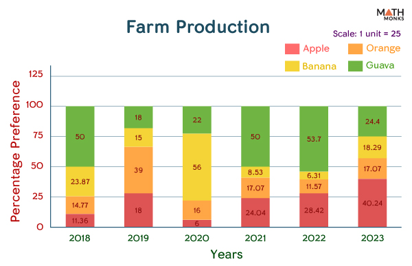
However, the data in each group does not add up to 100 in each case. For that to happen, we need to use a 100% stacked bar graph by converting the individual data in each group to percent. In a 100% stacked bar graph, each bar adds up to 100%, and each part of the bar represents a percentage of the whole.
A 100% stacked bar chart is more appropriate when we want the percentage breakdown of each category. Also, when the bars in the normal stacked bar chart are not of the same height (as in the case above), the 100% stacked bar chart can help to compare the percentages between the bars by maintaining uniformity.
For example, if we want to represent the above data of a stacked bar graph in the form of a 100% stacked bar chart, we will convert the data into percentages after collecting the raw data:
Step 2: Converting the Data to Percentages
For the year 2018
44 + 21 + 13 + 10 = 90
Thus,
% Farmers who preferred apple production = [(44 ÷ 88) × 100]% = 50%
% Farmers who preferred orange production = [(21 ÷ 88) × 100]% = 23.87%
% Farmers who preferred banana production = [(13 ÷ 88) × 100]% = 14.77%
% Farmers who preferred guava production = [(10 ÷ 88)× 100]%) = 11.36%
Here, 50% + 23.87% + 14.77% + 11.36% = 100%
For the year 2019
18 + 15 + 39 + 28 = 100
% Farmers who preferred apple production = 18%
% Farmers who preferred orange production = 15%
% Farmers who preferred banana production = 39%
% Farmers who preferred guava production = 28%
For the year 2020
22 + 56 + 16 + 6 = 100
% Farmers who preferred apple production = 22%
% Farmers who preferred orange production = 56%
% Farmers who preferred banana production = 16%
% Farmers who preferred guava production = 6%
For the year 2021
41 + 7 + 14 + 20 = 82
% Farmers who preferred apple production = [(41 ÷ 82)× 100]%) = 50%
% Farmers who preferred orange production = [(7 ÷ 82)× 100]%) = 8.53%
% Farmers who preferred banana production = [(14 ÷ 82)× 100]%) = 17.07%
% Farmers who preferred guava production = [(20 ÷ 82)× 100]%) = 24.4%
Here, 50% + 8.53% + 17.07% + 24.4% = 100%
For the year 2022
51 + 6 + 11 + 27 = 95
% Farmers who preferred apple production = [(51 ÷ 95)× 100]%) = 53.7%
% Farmers who preferred orange production = [(6 ÷ 95)× 100]%) = 6.31%
% Farmers who preferred banana production = [(11 ÷ 95)× 100]%) = 11.57%
% Farmers who preferred guava production = [(27 ÷ 95)× 100]%) = 28.42%
Here, 53.7% + 6.31% + 11.57% + 28.42% = 100%
For the year 2023
20 + 15 + 14 + 33 = 82
% Farmers who preferred apple production = [(20 ÷ 82)× 100]%) = 24.4%
% Farmers who preferred orange production = [(15 ÷ 82)× 100]%) = 18.29%
% Farmers who preferred banana production = [(14 ÷ 82)× 100]%) = 17.07%
% Farmers who preferred guava production = [(33 ÷ 82)× 100]%) = 40.24%
Here, 24.4% + 18.29%+ 17.07% + 40.24% = 100%
Thus, by finding the percentage values of the above data, we get
2018
2019
2020
2021
2022
2023
Apple
50%
18%
22%
50%
53.7%
24.4%
Orange
23.87%
15%
56%
8.53%
6.31%
18.29%
Banana
14.77%
39%
16%
17.07%
11.57%
17.07%
Guava
11.36%
28%
6%
24.4%
28.42%
40.24%
Step 3: Plotting the Graph
A horizontally stacked bar graph with the same data is plotted below:
Horizontal Stacked Segmented Bar Chart Graph 100 Percent
However, there is a demerit of using the segmented bar graph, as by looking at the graph, we cannot exactly find the frequency of each event and the total number of each section.
Thus, segmented bar graphs are used to compare and contrast data between different categories. This type of graph is most useful when many data points are to be compared, as it can be challenging to see the differences between them when they are all displayed on a single line.