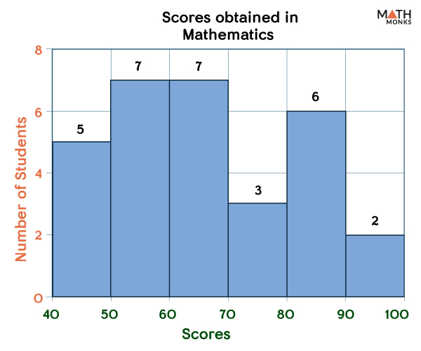
A histogram is a representation of a data set graphically in the form of bars of different heights. Karl Pearson, an English mathematician, invented the histogram. Below is a histogram showing the scores in mathematics of grade 4 students of St. Paul’s school.
Histogram
How to Interpret a Histogram
Thus, a histogram is somewhat similar to a bar graph. Here the data is grouped into ranges, and each range corresponds to a bar. The horizontal axis represents the groups of different data. In contrast, the vertical axis corresponds to the amount of data in each range.
Thus, a histogram condenses a data series into a form that is easily interpreted. It is thus widely used in statistics to show how many of a particular type of variable occur within a specific range.
How to Make a Histogram
Follow the following steps while creating a histogram:
Find the range of the data (Range = Maximum Value – Minimum Value).
Choose the number of bins.
Calculate the bin size (there is no fixed bin size; however, it should be a manageable size). It is calculated using the formula: Bin size = Range/Number of Bins.
Choose the scale of the x and y axis and plot the graph.
Let us plot a histogram using a given set of continuous variables.
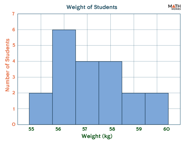
Mr. Raven is a tutor who teaches mathematics. He decided to calculate the weight of his 15 students and represent them in the form of a histogram.
To construct a histogram from a continuous variable, we first need to split the data into intervals called bins. Accordingly, Raven formed a frequency distribution table dividing the data into 5 intervals. The class interval for each interval is 5
Weight (kg)(Class Interval)
Number of Students (Frequency)
30 – 42
6
43-47
5
48-52
4
53-57
2
58-62
3
When we represent the above data, we get the histogram given below:
Histogram Graph
We need to ensure that there is no space between the bars while plotting a histogram. Let us plot another histogram with a different set of data.
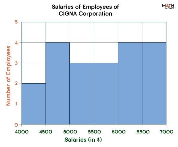
E.g. 1. Prepare the histogram corresponding to the given frequency table showing the employees’ salaries of CIGNA Corporation in New York.
Salary Range
4000 – 4499
4500 – 4999
5000-5499
5500-5999
6000-6499
6500-6999
Number of Employees
2
4
3
3
4
4
Histogram Example 1
When to Use a Histogram
Thus, a histogram is prepared when:
When the data is numerical
When the data has a single independent variable such as the height, weight, or age of persons
When the data has a continuous range, like the score achieved by students
When two data sets need to be compared, such as the marks obtained by two students on the same subjects
Types of Histogram Shapes
Histograms can be of different kinds based on the frequency distribution of the data. There are different types of distribution, such as normal distribution, skewed distribution, bimodal distribution, and multimodal distribution.
The histograms are named based on the type of data they are representing into the following types:
Uniform Histogram
It is a histogram where all the bars are almost of the same height, contain the same number of elements, or have a uniform distribution.
Bimodal Histogram
Here, the histogram has two peaks. These points are not necessarily of the same height. The two peaks mean that the two groups in the given frequency table have the most occurrences.
Right Skewed Histogram
We can understand that the histogram is skewed to the right by the name. It happens when most data is concentrated towards the end of the distribution.
Left Skewed Histogram
It is a histogram that is skewed to the left. Such type of graph is found when most of the data is concentrated towards the start of the distribution.
What are Histograms Used For
Some common uses of histograms are:
Reading the Distribution of the Data
With histograms, viewers can analyze the nature of frequency distributions. Some distributions may be symmetric, with the mean around the mid-value. While others may be left or right skewed in which the data’s mean value is around the beginning or the end of the data range. The data may also have a uniform distribution where every bin has almost the same data points. The histogram thus helps to estimate the mean value of the data provided.
Analyzing the Change in the Data Pattern
Histograms help to identify the change in the pattern of data with time. For example, suppose a histogram shows the number of students newly admitted to a school per year. In that case, it will help us to analyze whether there is an overall increase or decrease in the number of students admitted per year.
Histogram vs. Bar Graph
Although similar visually, the most straightforward way to distinguish between them is that there are spaces between bars in a bar graph. However, in the histogram, the bars are adjacent. Another key difference is that the histogram represents the distribution of non-discrete variables. In contrast, the bar graph displays the comparison of discrete variables. For more differences, visit our Histogram vs Bar Graph article.
Last modified on August 3rd, 2023
2 thoughts on “Histogram”
Is a skewed histogram considered a type of histogram? Does a type of histogram just a different way of representing data?
Yes, the skewed histogram is a type of histogram in which most of the data falls to the right or the left of the graph’s peak.
A histogram, in general, is a graphical representation of the distribution of numerical data, where the data is divided into bins or intervals, and the frequency or count of data points within each bin is depicted by the height of the bar.