Histograms and bar graphs visually represent statistical data in graphical form. However, there are many differences in the type of data they display, how they look, and their practical applications.
Histogram
A histogram is a graphical representation of a simple, continuous data set, giving a comparative analysis of the data based on its frequency.
A bar graph, bar chart, or column chart compares quantitative data between different categories. The categories are represented along the x-axis, and their values along the y-axis. There is always a separation between the bars showing each category. Using the data, we can perform numerical analyses such as averages, sums, and differences. Learn more about it in our article on Bar graph.
The main differences between a bar chart and a histogram are described below.
Basis
Histogram
Bar Graph
1. Data Type
Represents numerical or quantitative data (both continuous and discrete)
Represents a single set of numerical or quantitative data.
2. Data Organization
The bars touch each other, showing the continuous data range.
Bars do not touch, showing the separation between categories.
3. Data Distribution
The widths differ, and the area of the bar shows the frequency.
The height of the bars shows the frequency, and the widths are the same for all.
3. Appearance of data
It helps to view a dataset’s distribution, or relative frequencies, of values.
It helps to compare and contrast metrics (such as averages and sums) across different categories.
4. Data Order
The bars are always arranged from lowest to highest.
The bars can be arranged from largest to smallest or viscera.
Example
Let us consider an example to understand the concept better.
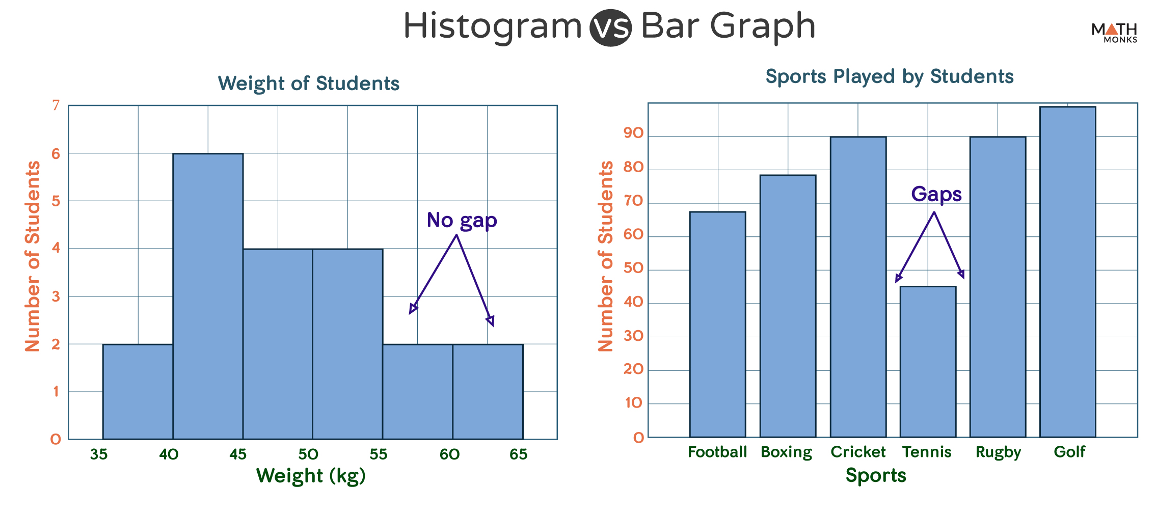
Histogram vs Bar Graph
In the above diagram, the left panel shows the histogram, and the right panel shows the bar graph. Note that the y-axis shows the number of variables or data in both cases, while the x-axis can be anything. The only difference being the data in the histogram is continuous (non-discrete), while in the bar graph, it is discrete.
Thus, choosing between a histogram and a bar graph depends on our goal. If we want to look at the frequency of certain values in a single dataset, we will use a histogram. In contrast, we will use a bar graph if we require comparing categories.